Showing posts with label weather records. Show all posts

Wednesday, June 8, 2011

RSS AMSU: all cooling and warming trends through May 2011

There is still a lot of confusion and misinformation concerning the question whether there has been a cooling trend or a warming trend between some moment XY and the most recent months.

To lift the confusion, I (and Wolfram Mathematica 7.0.1) have calculated 3500 linear regressions and the result is offered to you in this truly tall PDF file:
RSS AMSU trends in °C per century
The file above allows you to pick any month between January 1979 and April 2011 as the starting month. The last month is May 2011. The table offers you all trends - calculated accurately - expressed in Celsius degrees per century. The line for May 2011 contains the actual most recent temperature anomalies.


In the table, you find not only the trends of the global temperature but also the trends of the regional temperatures observed by RSS AMSU, a satellite team. Apologies that I picked RSS - Roy Spencer et al. are doing a great job but I just want to avoid possible accusations that I have picked the skeptics and the most cooling dataset etc.

Let me just select two lines among the nearly 400 lines that the table offers you. The warming or cooling trends between January 1979 and May 2011 have been
  • +1.43 °C / century: globally
  • +1.32 °C / century: tropics
  • +2.23 °C / century: North extratropics
  • +0.69 °C / century: South extratropics
  • +3.40 °C / century: Arctic
  • -0.19 °C / century: Antarctica
  • +1.63 °C / century: contin. USA
  • +1.90 °C / century: North Hemisphere
  • +0.93 °C / century: South Hemisphere
You see it's been mostly warming in the 31+-year period. However, let's write the same numbers with January 2001 - the beginning of the new century - as the initial month. Note that we're not trying to include the El Nino year 1998: instead, we just pick the most natural beginning of the centtury. It's been more than 10 years and the linear regression in this period gives us:
  • -0.40 °C / century: globally
  • -1.16 °C / century: tropics
  • +0.22 °C / century: North extratropics
  • -0.19 °C / century: South extratropics
  • +3.83 °C / century: Arctic
  • -1.27 °C / century: Antarctica
  • -4.84 °C / century: contin. USA
  • -0.23 °C / century: North Hemisphere
  • -0.58 °C / century: South Hemisphere
These are decidedly different numbers! The globe has been slightly cooling since January 2001 although the trend has been less than half a degree per century. The tropics saw more than one degree of cooling per century. The Arctic has seen a significant continued warming by four degrees per century, the Antarctica experienced a cooling by a degree per century.

The biggest figure (when it comes to the absolute value) that you may see anywhere in the tables above is the trend since 2001 in the United States of America. The U.S. has been cooling by nearly 5 Celsius degrees per century since 2001. The global trend stays negative if you pick any month of 2001, 2002, or 2003 (except for December 2003) as the initial month. Quite generally, negative and positive trends are pretty much equally represented in the recent part of the table.

Obviously, you can't or you shouldn't extrapolate any of the figures. The shorter periods we investigate, the bigger trends we typically obtain. For example, the global cooling trend since May 2010 has been cooling by sixty degrees Celsius. ;-) But even when you look at the 31+-year trends, they show a huge variability. The "same" portions of the Northern and Southern Hemisphere display very different warming or cooling trends which imply that the (inevitable) changes are not "global" in any nontrivial sense.

Code:
midTroposphere = False; (* True/False *)

whereString = If[midTroposphere, "TMT", "TLT"];
a = Import[
"http://www.remss.com/data/msu/monthly_time_series/RSS_Monthly_MSU_\
AMSU_Channel_" <> whereString <>
"_Anomalies_Land_and_Ocean_v03_3.txt", "Table"]; Length[a]

labels = {"year", "month", "-70/ +82.5", "-20/ +20.0", "+20.0/ +82.5", "-70/ -20.0", "+60.0/ +82.5", "-70/ -60.0", "Cont. USA",
"0.0/ +82.5", "-70/ 0.0"}

b = a[[4 ;;]]; bwith = Prepend[b, labels]; Grid[bwith, Frame -> All]

(* Linear trends in bwith *)

LMfit[v_] :=
LinearModelFit[Transpose[{Table[i, {i, 1, Length[v]}], v}], x, x];

howmanyrows = Length[bwith] - 1
btrendsPREP = Table[
Round[1200 * D[Normal[LMfit[bwith[[m ;; howmanyrows + 1, column]]]], x], 0.01] , {m, 2, howmanyrows}, {column, 3, 11}];
btrends = bwith;
btrends[[2 ;; howmanyrows, 3 ;; 11]] = btrendsPREP;

Grid[btrends, Frame -> All]

Monday, May 9, 2011

La Nina conditions ending

The latest pictures show that the cold, blue strip along the equatorial Pacific Ocean - which is associated with La Nina - has largely disappeared:


On the contrary, a warm, orange cloud is spreading from the South American Western beaches towards the West. The latest weekly summary of the ENSO dynamics shows that the Nino 3.4 anomaly has converged closer to zero - now it is at -0.5 °C which is just the boundary that defines the La Nina conditions. Chances are that by the next week, the reading will be between -0.5 and +0.5 which will indicate ENSO-neutral conditions.


The La Nina episode is delineated by the 3-month averages - and the averages up to March-April-May and maybe even April-May-June 2011 will remain in the La Nina territory. I find it slightly more likely than not that we will enter another El Nino episode after the ENSO-neutral conditions in the Summer.

Because the transition to ENSO-neutral conditions or El Nino will occur approximately in June and because the global mean temperature approximately responds with a 6-month delay, it's likely that the year 2011 will remain cooler than the average year of the recent era.

RSS AMSU satellite methodology has determined that the global temperature anomaly in April 2011 was just +0.11 °C which is 0.14 °C warmer than March 2011 but it is still the second coolest April since 1998 (included), after April 2008 which was even cooler.

Sunday, April 3, 2011

BEST: surface warming since 1880 seems robust to me

I watched a part of the climate hearings in the U.S. Congress - together with infantile ASCII exclamations by Gavin Schmidt and his comrades on a Science Magazine page whose URL was sent to me by a skeptic. ;-)

Kerry Emanuel has said lots of lies about the ClimateGate. Otherwise, the contributions by Scott Armstrong, John Christy, and Richard Muller made lots of sense. Peter Glaser and David Montgomery added a more economically oriented skeptical perspective.


Click to zoom in. Taken from BEST.

Richard Muller has presented preliminary results of the Berkeley Earth Surface Temperature (BEST). Let me say that I am utterly disappointed by the reality of the transparency that's been promised to us. In fact, BEST hasn't offered anything at all - even though it's already presenting its result to the U.S. Congress. I can't even get a single page of the overall data.

I am still waiting to download a few gigabytes with all the raw data - plus all the algorithms that realize their promised quality standards (so far many of them haven't been done).


On the other hand, unless Richard Muller is totally lying to the U.S. politicians, the graph above shows that it is pretty much unthinkable that a different analysis or selection of the weather stations would eliminate or radically modify the 20th century warming.

Two percent of the stations were randomly chosen, he claims, and the result still pretty much agrees with HadCRUT3 and others. Although I deeply appreciate the work by some of the famous volunteers, it seems very clear that their findings about the problems with the particular weather stations etc. can't have a noticeable effect on the major 20th century temperature trends.

I may have been "somewhat uncertain" about the 20th century warming in the past (I would have said that the odds that the fixes would eliminate the warming were about 1%) but I am not really uncertain now (the probability that those 0.8 °C or so seen in the surface records are artifacts of errors is smaller than 10^{-6}). Still, the risk 10^{-6} or so can't be reduced: if the warming is normally distributed as 0.75 +- 0.15 °C or so, the probability that the right figure is negative is a 5-sigma effect, so around 10^{-6}.

Regional uncertainties will remain larger but the average temperature in the places where weather stations have existed behaves just like the HadCRUT3 graphs and others have been indicating. And it even seems that the urbanization effects can't have a noticeable impact on the reconstructed global temperature because the random "urban signal" depending on the 2% selection would have to be larger.

On the other hand, the attribution and projections are an entirely different issue. It is very clear that some people will try to abuse the looming BEST press releases to promote the (catastrophic) anthropogenic global warming, which surely doesn't follow from the graphs at all. We should be kind of ready to point out those propagandistic tricks as they will occur.

(Also, a confirmation of the record from 1880 is surely no confirmation of the millennium reconstructions.)

Yesterday in the Congress, I liked an intervention of Scott Armstrong. A politician said that all the witnesses agreed that "global warming is happening". That's a very subtle and deliberately vague sentence! At the very end of the session, Scott Armstrong went through the hassle to point out that he disagreed that it "is" happening. It "was" happening in some periods in the past but what "will be" happening in the future is a different matter and an uncertain one.

Many laymen have a "short circuit" in their brains when they automatically assume that the apparent trends from the past may be extrapolated. But the trends in the previous 100 years and the next 100 years are totally different quantities. Moreover, if the same trend continued for 100 years, nothing bad would happen and the temperature change would still remain closer to zero than to the IPCC predictions (even their lower end).

Monday, March 14, 2011

La Nina weakened, likely to be gone before Summer


According to the most recent NOAA's weekly ENSO report, the NINO 3.4 index weakened from -1.3 or so a week ago (and from -1.8 in the early October 2010) to -1.0.


In fact, the NOAA folks think that the ongoing La Nina episode will end and ENSO-neutral conditions will return by June 2011. That should still be enough for the ENSO cycle to negatively contribute to the global mean temperature throughout 2011, making it one of the cooler years.

However, you can't be certain that the La Nina episode will end. The average of the models simulations just mildly crosses above the -0.5 °C threshold that defines the conditions. Some models remain below this threshold, in the La Nina territory, and you don't want to trust the models as such too much, anyway: 3 months is a pretty long time for similar predictions, as can be seen by the wild differences between the individual models' predictions.

Wednesday, March 9, 2011

Hansen: warming should have been 2-4 °F in the last decade

According to all the datasets except for GISS (and try to guess who is the boss of GISS), the 2001-2010 decade saw a very slight cooling trend.

In 1988, James Hansen gave a testimony in front of the U.S. Congress in which he overestimated the warming trend for the next 20 years by a factor of 5 or so. His graphs were somewhat chaotic. They disagreed with the actual temperature record and some people have disputed that his prediction was this bad.

Well, Steven Goddard found a fascinating newspaper article by Combined Miami News Services that eliminates all doubts.


Click to zoom in

In 1986, James Hansen was already predicting a man-made global warming doomsday, and among lots of other utter nonsense, he comprehensibly articulated the following prediction for the temperature change during the first decade of this century:
Hansen said that the global temperature would rise by 2 to 4 degrees in the following decade (after 2000).
Wow. Today, we know that the actual temperature change (from linear regression) was minus 0.1 Fahrenheit degrees or something of this kind, depending on the dataset. For James Hansen, once again, the trend should have been plus 2-4 °F per decade. That's 20-40 °F per century which is 11-22 °C per century.


No kidding. The exaggeration is at least by a factor of 10 or so.

Everyone who believes in the explanation that James Hansen has become senile has been proved wrong. As a younger man, he was at least as big a psychopath if not a bigger one than what he is now. At least since 1918 or so, Jehovah's Witnesses were much more sensible and careful about the end of the world. Why would a sane person declare that the temperature change will suddenly jump by a factor of 10 or 20?

The article also explicitly predicts a doubling of CO2 to 560 ppm by 2040 (in reality, it will be around 2080) and a warming by 8 degrees by the 2030s. ;-) It's kind of amazing that a self-evident crackpot of this caliber who has been discredited so thoroughly and irreversibly has the chutzpah to show up in the public or even in NASA.


Progress tracker

Some news from the high-tech carbon business: I just learned from Al Gore that the United Nations carbon office has introduced a new great tool for several billion dollars:
Progress Tracker (at the top of the page)
This great invention may look like a calendar - well, a horizontal list of months of the year 2011. But don't be fooled: it also shows the number 21 below February 2011 and the number 28 below March 2011! The most spectacular feature of the new progress tracker is that it also displays the local time not only in New York but even in Bonn and Kyoto.

Imagine: it's the same Kyoto where the famous Kyoto protocol was signed! And billions of people may suddenly watch the local time in this important city that is carefully watching, 24 hours a day, the progress in realizing the Cancún's declarations where the participants have vowed to meet again, at yet another exotic destination.

It's so handy. Thank you for the tip, Al! Too bad that the technology behind the cell phones can't make a similarly fast progress as the high-tech know-how of the U.N. climate experts and Al Gore. Just imagine that the evil capitalists such as Steve Jobs would become able to produce a spectacular Cancún Progress Tracker with the Kyoto Local Time. The world would be a stunning place.

Wednesday, March 2, 2011

February UAH AMSU: -0.02 deg C

Roy Spencer has announced the final global UAH AMSU anomaly for the lower troposphere: it is -0.018 °C which means that it was just slightly cooler (by a statistically insignificant difference) than the average February from the 1980-2010 benchmark period.

As you can see, global warming causes not only warming and cooling (not to mention warmcold winters and coldwarm winters) but also the ultimate mediocrity and stability of temperatures. ;-)


The global figure is 0.008 °C cooler than the January 2010 figure and the regional readings remained almost unchanged, too.


Both hemispheres - the Southern and the Northern one - had anomalies that were anomalously close to zero. ;-) Tropics remained at -0.35 °C which is negative but not unusually large negative.

The mid troposphere was probably somewhat more visibly below the average.

The La Niňa conditions that looked very likely to disappear a week ago have been revived a little bit (what I mean is the new small blue blob near the South American equatorial beaches) so it is again equally likely that the episode will continue at least for another season as that it will end before Summer.

I hope that the dear reader will forgive me the Czech spelling of Spanish words such as Niňa: it looks pretty similar like the tilde, doesn't it? :-) And it's much faster for me to write it.

Monday, February 14, 2011

Korea: heaviest snowfall on record

This blog entry is the 4,000th text on this blog.

In March 2000, scientists at The Independent proved that there would never be any snow again:
Snowfalls are now just a thing of the past
Researchers from world-renowned places such as the University of East Anglia - this one became even more renowned a few years later :-) - confirmed that "snow is starting to disappear from our lives," much like sledges, snowmen, and snowballs.

Another proof they used were the first two months of the year 2000 that didn't bring much snow to the U.K. It followed that the snow wouldn't return, the exceptional thinkers concluded.

Ten years later, the 2000 article has gone viral so that The Independent published another article in January 2011, Don't believe the hype over climate headlines, in which Steve Connor claims that The Independent only wrote rubbish in the headline in order to attract readers. Well, the author forgot to mention that the body of the text was also composed out of rubbish, much like 99% of what his newspaper has ever written about the climate.


Not just the "contrarians", as the sane people are called by the author, but everyone knows that after a series of intense winters in Europe, the U.K., and America, the message has become that the snow is actually caused by global warming, together with warmcold winters and coldwarm winters - as well as Januaries whose UAH temperature anomaly is 0.00 °C, e.g. January 2011.

And the snow will be caused by global climate change until the weather changes again. Then the scientific consensus of the leading scientists who haven't managed to be jailed in a psychiatric asylum yet will make another uniform U-turn: the snow will permanently disappear again. ;-)


In South Korea, where the ongoing snowfall is heaviest in more than a century, 12,000 soldiers were ordered to rescue stranded citizens as extra snowfalls are predicted for the coming hours. The video offered by the BBC website is pretty cool.

Needless to say, the snowfall didn't avoid North Korea, either. The traces of agriculture and other economic sectors that haven't yet been fully destroyed by the global warmists' closest ideological allies were "badly affected by the heavy snowfall." The four main enemies of communism are called Spring, Summer, Fall, and Winter. The newest version of communism, the global warming alarmism, has discovered that all these four enemies - including all the climate change - were created by the evil capitalist in order to destroy the communists.

That won't make the life of our North Korean comrades easier. Two days ago, North Korea asked the Czech Republic for food aid. It turned out that the new leaders of the free world were not the only country that has heard such a request. ;-)


La Nina may end in a few months

Today's weekly ENSO report shows that the ENSO ONI 3.4 anomaly has weakened to -1.2 °C and slight positive anomalies in the very Eastern part of the equatorial Pacific may indicate that the current La Nina episode may end by May or June. But I can't guarantee that.


Civil war in Sierra Club

Finally, Sierra Club has decided to do something I have been encouraging them to do for years: to confront the climate cranks. So I would like to hope that the climate cranks similar to Al Gore and Mark Hertsgaard will quickly see the results of this confrontation on their bloody buttocks. But I don't actually believe that the climate cranks themselves may do a good job in confronting other climate cranks.

You may join Generation Hot on Facebook for a minute and write your list of climate cranks who should be confronted. Then you may "unlike" the page again if you wish. ;-)

Thursday, February 3, 2011

Global UAH AMSU: January 2011 cooler than normal

Dr Roy Spencer has released the January 2011 reading of their UAH AMSU global temperature. Ladies and Gentlemen, the anomaly is
Delta T = -0.009 °C.
Imagine that you're a global warming alarmist who has been working on the climate apocalypse for decades.

You have been talking about constantly growing temperatures, even though you knew that the temperatures only grow approximately 50% of the time; you have been editing, adjusting, splicing, and cherry-picking graphs; you have been inventing all kinds of catastrophes that follow from this non-existent constant growth of temperatures even though you knew that none of them would be taking place even if the temperatures were rising uniformly; you have been attacking everyone who knows some science or who has at least some common sense of integrity left.


You must know, not too dear global warming alarmist, that you are an immoral person.

And you have also assumed that Nature was obliged to obey your particular provincial mutation of the Marxist orthodoxy because Nature is the last one who should play any role in your grand plans. Except that all the work that you have accumulated led to a vanishing outcome: relatively to other Januaries in the recent 30+ years, Nature is actually cooler than the average. Nature doesn't give a damn about your lies, not so dear alarmist hippie, and it actually thinks that you are a pathetic jerk.


Your stocks are in the red numbers and you should be treated just like any company that has gone bankrupt. One moderate La Nina - one weather pattern among dozens of comparable phenomena and drivers - was essentially enough to beat the trend from all the "sinful CO2 emissions" that have been released in at least several decades.

Sunday, January 9, 2011

Weather in the year 3000: once again

Two years ago, we discussed a report in MSNBC about a paper that was predicting the climate for the year 3000.


Boston's industrial suburbs, January 2100: that's a foreseeable future in comparison with the paper we discuss now

Now it's 2011 and Nature Geoscience is just going to offer us another paper about the weather in the year 3000: who cares that no one can really make predictions for February 2011? ;-)
University of Calgary: press release

Ongoing climate change following a complete cessation of carbon dioxide emissions (abstract)
The very first sentence of the abstract shows that the article is about political advocacy rather than science: "A threat of irreversible damage should prompt action to mitigate climate change, according to the United Nations Framework Convention on Climate Change, which serves as a basis for international climate policy."


We are told that Canada's weather will be OK while Antarctica will heat up by 5 °C and the West Antarctic ice sheet will collapse, raising the sea level at least by four meters. Meanwhile, most of North Africa will be desertified, and so on. And all these things will occur due to CO2 emissions.

Needless to say, these statements are completely preposterous from a scientific viewpoint.

What will actually happen with the global averages?

First of all, the CO2 emissions will converge towards zero sometime between 2030 and 2200 because the fossil fuels will (have to) be replaced by other sources of energy: they will get depleted as some point. (Replacements are known already today - they're just uneconomic at the present.) I really don't know the exact year and I don't think it's important for any purpose to speculate about this year. As we will explain in quite some detail, by the year 3000, the CO2 concentration will return towards the value dictated by the external temperature.

The Antarctice ice core data show very clearly that this is what CO2 does, after a 800-year lag (plus minus 600 years). The reason has been discussed almost infinitely many times.


The graphs from the last 400,000-600,000 years show a very tight correlation between CO2 and temperature. However, a closer scrutiny reveals that the CO2 changes are lagging behind the temperature changes by 800 years in average.

We also know why it is so. The relevant layers of the ocean are able to emit/absorb the gases - including CO2 and methan - to/from the atmosphere. However, it takes time for these layers of the ocean to adjust their temperature to the atmosphere around them. After 800 years or so, they do so and emit/absorb the right amount of the trace gases to/from the atmosphere so that the concentration agrees with the temperature.

Because of the human activity, there will be something like 600-1000 ppm of CO2 at the peak level.

However, the CO2 concentration that can be in natural equilibrium with the temperature at that moment is about 300-320 ppm because the greenhouse warming from doubling or quadrupling CO2 relatively to the pre-industrial levels will be just between 2 and 4 °C and the graphs above show that this warming is equivalent to the CO2 increase by 20-40 ppm, it's clear from the historical record that within 800 years, the CO2 concentration will return from 600-1000 ppm to 300 ppm in at most 800 years. Once it happens, the greenhouse effect of the disappeared CO2 will be undone, too.

The time 800 years above is actually likely to be a significant overestimate; CO2 will return close to the pre-industrial levels much more quickly than that. Why? Many people still don't understand the positive and negative contributions to CO2 in the atmosphere, so let's review a few basic facts again.

Well, the total amount of CO2 in the atmosphere is known to be 3,160 gigatons. The civilization annualy emits 29 gigatons of CO2. (Be careful not to confuse this counting with the counting that only includes the mass of the carbon atoms in CO2. In that convention, 29 gigatons is replaced by 8 gigatons, 12/(12+16+16)=12/44 times those 29 gigatons.)

So we annually emit 29/3,160 = 0.92 percent of the existing CO2 in the atmosphere. The concentration should therefore increase by 0.0092 * 388 ppm = 3.56 ppm every year. In reality, it only increases by 1.86 ppm or so: we can measure how quickly the CO2 is actually increasing every year (the Keeling curve). It follows that the difference between Nature's absorption and emission must be approximately 1.7 ppm every year. Nature prefers to absorb CO2.

What many people don't understand is that this "excess of natural CO2 sinks over the CO2 sources" would continue even if we immediately stopped all CO2 emissions next week. Nature doesn't try to balance a fixed portion of our emissions during the last financial year or something like that which is what some people apparently and nonsensically believe; instead, the figure 1.7 ppm or so only depends on the concentration that is already "out there". Why? It's because this excess of sinks exists because the CO2 is elevated above the equilibrium dictated by the current global mean temperature - which is about 290 ppm. Just look at the graph above.

Carbon dioxide sinks cannot measure which CO2 molecule is anthropogenic and which CO2 molecule was emitted during the last year: they are only sensitive to the CO2 concentration around them and this is what influences their absorption rate. How much the humans have emitted during the last year is totally irrelevant for the CO2 sinks. That's why the idea that the "airborne fraction" would remain fixed even if the industrial CO2 emissions rapidly changed is absurd: what is nearly fixed is the total absorption (minus emission) by Nature - 1.7 ppm per year or so.

We're just less than a Celsius degree above the pre-industrial global mean temperature whose equilibrium CO2 concentration was 280 ppm - and you need about 10 °C of warming to naturally change CO2 by 100 ppm (see the ice core data for the glaciation cycles). So 1 °C of warming can only raise the equilibrium CO2 concentration by 10 ppm or so.

Because the actual concentration is substantially above 290 ppm today - because of our direct emissions - it follows that the natural processes that consume or absorb CO2 are strengthened, and those that produce or emit CO2 are weakened. This imbalance can be quantified and we have already mentioned what the empirically measured overall result is: aside from the sinks that match the sources, Nature absorbs additional 1.7 ppm from the atmosphere every year. Because the CO2 concentration is 390 ppm instead of 290 ppm, i.e. we're 100 ppm above the equilibrium value, Nature absorbs 1.7 ppm a year. You should realize that there is an approximate proportionality law between this 100 ppm excess and those 1.7 ppm sinks. If we were at 490 ppm i.e. 200 ppm above the equilibrium concentration, Nature would absorb about 3.4 ppm a year, and so on.

So if we stopped all emissions next week, the CO2 concentration in the atmosphere would be decreasing for many years by 1.7 ppm a year or so, and in less than a century, the concentration would be below 320 ppm or so. (Of course, the rate of decrease would get slower as the concentration would approach those 280-290 ppm again.)

Needless to say, the decrease would be even more dramatic if the emissions suddenly stopped at a much higher CO2 concentration. Imagine it's the year 2150 and the CO2 concentration is 1,000 ppm - which is not dangerous in any way (some people only start to get dizzy at 5,000 ppm). The temperature from the two CO2 doublings will be about 1-3 °C higher than in the pre-industrial era because of the greenhouse effect. But even if you imagined 5 °C, it wouldn't make much difference.

This temperature would predict the equilibrium CO2 concentration to be just 280 ppm + 10-30 ppm - between 290 and 310 ppm (or slightly higher for the unrealistic 5 °C warming). But 1000 ppm is about 700 ppm above this value - so Nature will actually be likely to absorb 7 times 1.7 ppm a year, a whopping 12 ppm a year. In less than two centuries, the CO2 concentration will return to numbers well below 350 ppm or so even if you begin at 1,000 ppm.

The actual observed lag - 800 years - is longer than the time needed to adjust the CO2 concentrations by the mechanism above because those 800 years is dominated by the time needed for the oceans to heat up or cool down - which is a slower process than the process we considered now - the ability of the oceans and the biosphere to absorb the excess CO2. The lag observed in the ice core data is the greater number among these two, or a sum of them. However, during the glaciation cycles, the external drivers were primarily changing the temperature and the CO2 followed the temperature after the oceans heated up or cooled down; in the industrial era, the external drivers - us - primarily change the CO2 concentration but the CO2 concentration still follows the temperature but the necessary process - the natural absorption of excess CO2 - is faster than the heating up and cooling down of the oceans.

At any rate, in the year 3000, the atmosphere will clearly experience no impact of our temporary, multi-centennial usage of fossil fuels at all. However, it doesn't mean that the climate at all continents will be the same as it is today. The climate is always changing but in the long run, surely at the time scale of a millennium, this fact doesn't depend on the humans or anthropomorphic gods in any way. Most of the important changes of the climate will be local, of course. The very concept of a global climate is a deep misunderstanding of science.

Via Tom Nelson

Friday, January 7, 2011

Climate sensitivity from a linear fit

The sloppiness on John Cook's blog is unlikely to be coincidental

In this text, I would like to settle the question what is the climate sensitivity - warming attributed to CO2 doubling - from the observed CO2 concentrations and global mean temperatures from 1850. At the very beginning, let me tell you that the result will be 1.66 °C if all observed global warming were due to the CO2 growth.

This text will be vastly more accurate and less sketchy than a text by Keith Pickering about the climate zombies (us) at John Cook's blog.

Growing CO2 concentration

First, let me offer you an excellent Ansatz for the concentration of CO2 in the year "year" during the industrial era. We won't usually need it but it's simply:
conc(year) = 280 ppm + 22.3 ppm * exp[(year-1920) / 57]
You see that for a very small year, like 1776, the concentration is close to 280 ppm. For the year 1920, it is chosen to be 280+22.3 = 302.3 ppm, and the deviation from 280 ppm is exponentially growing with 57 years being the e-folding time (the time in which the deviation increases 2.718 times).


You may also calculate that in the year 2010, the formula predicts 388 ppm and the current annual growth of the CO2 concentration - e.g. the difference between 2009 and 2010 - is around 1.88 ppm per year. As you can see, the formula behaves very sensibly in the past (recent decades and centuries) and in the present.

However, the formula also predicts a continuation of the exponential growth in the future which I find very unlikely. For the year 2100, it predicts about 805 ppm while a more realistic estimate is below 600 ppm because the annual growth is somewhat likely to remain below 2 ppm per year. So we must be careful that the CO2 formula for the concentration is very accurate and established up to the present but it may deviate in the future.

Formula for the greenhouse warming

Another formula I will be using is the climate-model-based quasi-logarithmic function that calculates the no-feedback warming induced by an increase of the CO2 concentration. The relevant functions can be found in the IPCC report and at other places:
tempPREP[conc_] := Log[1 + 1.2 conc + 0.005 conc2 + 0.0000014 conc3];
temp[conc_] := tempPREP[conc] - tempPREP[280];
The "tempPREP" function is OK up to an additive shift; the additive shift in "temp" is chosen in such a way that "temp=0" for "conc=280 ppm" - a pre-industrial base line. You see that the function is essentially a logarithm. However, to be more accurate, the argument of the logarithm contains some nonlinear terms in the concentration. It's still true that the warming induced by the increase from 280 ppm to 560 ppm is about 1.2 °C:
temp[560] = 1.186 °C.
The logarithm in the formula above is natural and you need to be careful about the bases as well as about the nonlinear terms to get the right figure.

This figure contained no feedbacks. I will assume that the feedbacks act in such a way that they simply multiply "temp[conc]" by a universal coefficient (and add a universal additive shift).

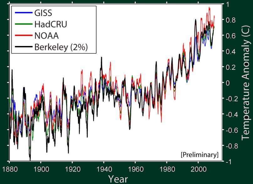
Fine, so take all the HadCRUT3 annual global temperatures from 1850 to 2010 and draw a simple graph: on the x-axis, you will have the temperature increase "temp[conc[year]]" predicted by the no-feedback formula above (whose climate sensitivity is 1.186 °C); on the y-axis, you will have the actual temperature anomaly from the HadCRUT3 tables. The graph will look like this:


The data points are not far from a straight line. On the other hand, the interpolation is not perfect: some low-concentration data points (those on the left) deviate from the predicted temperature by as much as 0.7 °C. However, the correlation coefficient is obviously rather high. The linear regression gives you
Had anomaly [year] = -0.48 °C + 1.40 * temp[conc[year]]
The absolute term -0.48 °C depends on the HadCRUT3 baseline; what is important is the coefficient 1.40 that gives us the amplification by feedbacks, as extracted from the actual observed CO2 and HadCRUT3 temperature data, while attributing all the temperature changes to CO2. Because the coefficients exceeds 1.0, the data interpreted in this way imply a weak positive feedback.

We have extracted the best linear fit from the observed data and it tells us that
warming [conc_] = 1.40 * temp[concentration]
where the function "temp", involving a logarithm, was defined at the top. In particular,
warming [280 ppm] = 0 °C,
warming [560 ppm] = 1.66 °C.
The first line verifies that the base line of "temp" was chosen at the "average" pre-industrial temperature; the second line is the total warming you obtain from the CO2 doubling, and it is 1.66 °C. Once again, this figure was obtained by assuming that all warming observed since 1850 should be attributed to CO2.

The text on John Cook's blog - either because of sloppiness or deliberately - used a linear prescription for the warming as a function of the concentration instead of the more realistic, IPCC-like quasi-logarithmic function. This mistake has of course enhanced the warming predicted for higher concentrations (on the right side from the data points) and their result was 2.38 °C, compatible with the IPCC interval. However, the actual result you get from this procedure is 1.66 °C and it is below the lower end point of the IPCC interval.

By their sloppiness and/or errors, they overestimated the correct result of their very method by 43 percent. See the first fast comments for more remarks about this point.

We may also calculate that
warming [389 ppm] = 0.76 °C
which is the warming we should have received so far according to the optimized logarithmic formula. It follows that 1.66 - 0.76 = 0.9 °C of warming would be left until the moment of reaching 560 ppm which I expect to be pretty close to the year 2100.

Instead of 0.9 °C, John Cook's blog produces the figure 0.0085*170 = 1.45 °C for this very question - which is an overestimate by stunning 60 percent. We're not even arguing whether the methodology makes sense; if you just fix the functions by correcting a simple mistake they're demonstrably aware of (and they make fun of), you will get a hugely different result than they have obtained.

Again, let me emphasize that these expected figures for the warming (I mean my results, the correct ones) are likely to be overestimates because I/we have assumed that the whole observed warming could be represented as the effect of CO2 plus "noise". However, it's more likely that other climate drivers have contributed by temperature changes of the same sign as the observed total ones, so the effect of CO2 was smaller - and it's only the effect of CO2 that may be extrapolated. For example, it's pretty clear that it's been warming since the little ice age. If 1/2 of the warming were caused by non-CO2 effects, all the predictions for CO2-induced would have to be divided by two.

Clearly, even if you attribute everything to CO2, a warming by 1 °C per century would still represent no threat in any sense. After all, we have tried it in the 20th century, too.

Finally, let me mention that even if the CO2 emissions continued to exponentially increase for another century, in agreement with the formula at the very top of this blog entry, we would reach 805 ppm in the year 2100. The corresponding warming since the pre-industrial era would be
warming [805 ppm] = 2.62 °C
or 2.62-0.76 = 1.86 °C from 2010. That's hardly a reason for concern - and it is the very maximum number that you may conceivably get by such manipulations. It assumes that the consumption of fossil fuels will continue to grow exponentially for another century, and that all the observed "systematic" temperature change in the last 160 years may be attributed to CO2.

Of course, you may invent huge conspiracy theories - that most of the warming so far was masked by some cooling source that will suddenly end, or something like that. Such claims are extremely unlikely especially because we know that after the little ice age, it was getting warmer even without any CO2 growth. Of course, the more nutty your conspiracy theory will be, the further from the numbers above you may get.

Sunday, January 2, 2011

RSS: 2010 was the second warmest after 1998

The RSS AMSU satellite team managed to be the fastest one once again. Its December 2010 data are out and we may compute the average temperatures for the years, too.


Because it's a new year, I calculated the exact averages, taking the right number of days in each month (including leap years) into account. The ranking is as follows:
  1. 1998: 0.549 °C
  2. 2010: 0.510 °C
  3. 2005: 0.374 °C
  4. 2003: 0.358 °C
  5. 2002: 0.334 °C


It was the 12th year in a row that wasn't able to surpass 1998 so the lukewarm year 1998 remains the "hottest one", or the "least cold year", depending on your preferences, on the RSS AMSU record.

El Nino and La Nina

Can these numbers be understood by looking at the ENSO index, i.e. the El Nino and La Nina episodes? They partially can.

While the data from 1979 show 0.15 °C per decade of warming, none of it can be observed, in a statistically significant way, from 1998.

If you want to use one three-month period of ENSO data to predict the annual average global temperature for a year, it's optimal to take the three-month period centered on January of the same year (the beginning of the year) - the Dec-Jan-Feb period. This one has the highest correlation with the temperature of the whole year - a fact that is compatible with an approximate 6-month delay in the impact of ENSO because the average of year is most tightly correlated with the temperature of the middle of the year, i.e. June or July.

If you write down the optimum linear fit for the average temperature of the whole year, you get
RSS anomaly for year = 0.09 °C + 0.07 x ENSO (Jan)
where ENSO (Jan) is the Dec-Jan-Feb ONI 3.4 average index (also in °C) from the beginning of the same year.

Because the 2009-2010 El Nino was just somewhat weaker than the 1997-1998 El Nino, the predicted annual mean temperature, according to the formula above, is exactly 0.30 °C cooler than the actual observed RSS annual mean temperature. This fact is both true for 1998 and 2010. So if you adjust the RSS temperatures for the El Nino index, there has been no noticeable extra warming or cooling from 1998.

However, even with the adjustments, there has been a warming by 0.15 °C per decade since 1979 when the satellite measurements began. This fact remains unchanged if you add the ENSO adjustments. However, the statistical data make it viable to say that all of the warming occurred before 1999.

If you want to make predictions for 2011, the relevant 2011 ENSO index - which is right now - is about -1.7 °C, about 3.4 °C cooler than the relevant ONI index for 2010 which was 1.7 °C one year ago. Multiply the difference by the coefficient 0.07 above to get 0.24 °C or so. So 2011 is predicted to be 0.24 °C cooler than 2010, plus some noise.

If this prediction were accurate, the RSS anomaly 0.55 °C from 2010 would drop to 0.31 °C which would mean that 2011 would be tied with 2007 as the 6th warmest year.

Wednesday, December 29, 2010

The globe cooled by 0.56 °C in four days

Throughout most of 2010, The UAH AMSU daily satellite temperature data have been showing almost each date to be the warmest one since 1998 or 1999. That was pretty much universally the case from January till the end of August.

However, even as recently as on December 16th, the day in 2010 was the warmest day with the same date since 1998. (The 1998 daily UAH data on that website only begin in August 1998 so the record-breaking warm H1 of 1998 is not included.)


This pattern has changed in the most recent week, however. On December 23rd, 2010, the global brightness near-surface temperature reached a local maximum of -16.75 °C. That was the fourth warmest reading since 1998 for that day after 2003, 2009, and 2006.


Things have gone in a different direction in the following four days. The most recent figure for the global brightness temperature is from December 27th, 2010, and it is -17.31 °C. This piece of data is the coolest number for a December 27th at least since 1998 (included).


The cooling between December 23rd and December 27th, 2010 is a whopping 0.56 °C. Pretty much all of 20th century global warming may have been erased within 4 days - the same time that Apollo 11 needed to get to the Moon, as correctly predicted by Jules Verne. ;-)

Did you notice that the "catastrophic" centennial global warming has disappeared in those four days? I don't think so because the observed centennial changes of the temperature have been zero for all practical (and a majority of impractical) purposes.

Because the end of December is near the annual minimum of the global temperature when the normal temperature is pretty much flat, almost none of those 0.56 °C can be attributed to the seasonal cycle. It's all about the random natural variability.

Despite these changes, GISS will probably declare 2010 as the warmest year but the other teams won't. Chances are that according to HadCRUT3, 2010 won't even be the second (or third) warmest year. Moreover, the cooler-than-normal temperatures are likely to continue (or escalate) in 2011.

Because La Nina is predicted to last at least through Spring 2011 (the most recent weekly 3.4 anomaly is -1.7 °C - it has strengthened again) and because its effect on the global temperature is delayed by 6 months or so, chances are that we will see cool global temperatures at least through Fall 2011. It is relatively plausible that 2011 will become one of the coolest years in the recent decade(s).

Sunday, December 26, 2010

Richard Alley: Climate sensitivity is 16-20 degrees

Richard Alley (on the picture) is a mentally ill hippie so it shouldn't be surprising that he became a professor of climatology at Penn State University, the same place where Michael Mann cooked his fraudulent hockey stick pseudoscience. Michael Mann remains at large.

After some years, Justin Gillis, a watermelon blogger at the New York Times, asked Alley about his research:
Climate Change and ‘Balanced’ Coverage
Alley mentioned that he gets annoyed if people think that 5-6 °F could be an overestimate because such an opinion reduces the holiness of the global warming cult. How does he fight against this undesirable heresy? Well, he invents a new number that could play the role of those 5-6 °F. What is it?

According to Mr Alley, a doubling of the CO2 concentration produces a 16 °F warming. The number was originally reported as 18-20 °F but the figure became a subject of a "correction". Now, despite the Obamacare, the new American socialist healthcare system wasn't able to offer Mr Alley a place in a psychiatric asylum that he unquestionably deserves.


Now, is it really difficult to see that whoever believes in a 16-20 °F of warming per doubling is an uncontrollable lunatic? Do you need to be a top researcher to see this fact? I don't think so.

16 °F of temperature difference translates to 9 °C or so. Can you obtain this warming by doubling the CO2 emissions? Well, we're adding 1.8 ppm - almost 2 ppm - into the atmosphere. At the current rates, the CO2 concentration is doubling in 150 years or so, depending on what you take as the base point. We should see 9 °C of greenhouse warming in 150 years or 6 °C of warming in 100 years.

Is that plausible that the observed data are consistent with the rate of warming that is 6 °C per century? Well, the answer is obviously no. We've seen a warming that is 10 times smaller. So if there is a warming trend by 6 °C per century, there must exist a source of cooling that cancels the warming with an accuracy that is nearly perfect.

This source of cooling would have to be adjusted to the rate of CO2-induced warming at every moment because the temperature change was hugely smaller than those 6 °C per century in every decade in recent centuries. Now, the source of cooling would have to be considered a complete mystery. No one has an idea what it could be and why it should be adjusted to agree with the hypothetical warming.

Even if it existed, it would be reasonable to assume that the source of cooling could remain adjusted to the warming rate so that the total warming would continue as we know it. And the warming was just 0.6 °C in the last century or 1.4 °C per century in the last 30 years. There is no known way, not even a cherry-picked way, to obtain 6 °C per century from anything that is linked to the empirical observations. Why would a sane person believe such a completely idiotic conspiracy theory?

A huge climate sensitivity of this kind predicts many other things and none of them has been observed. A huge climate sensitivity is undoubtedly one of the most easily excluded hypotheses in the climate science. To deny the fact that the climate sensitivity can't be that high, one has to deny pretty much every known fact about physics, the climate, and its history.

As Richard Lindzen has said, people such as Mr Alley are acting just like little children who are hiding in the closet, trying to find out how much he can scare other children.

Why should they stop at 20 °F? One can go further. Alley's comrade hippie Lee Smolin could apply his "knowledge" of quantum gravity to find out a better warming rate. What is the upper limit for the total warming by fossil fuels are implied by quantum gravity?

Well, yes, it is the Planck temperature, the highest temperature that is possible according to the laws of physics:
TPlanck = mPlanckc2 / kBoltzmann =
= sqrt(hbar.c5/G.k2) =
= 1.42 x 1032 Kelvin
That's a lot of degrees. In the path integral approach to quantum mechanics, thermal calculations may be evaluated by considering a periodic Euclidean time. For the Planck temperature, the length of the thermal circle becomes as short as the Planck length, the shortest distance that is possible according to the laws of geometry.

There is another simple way to encounter the Planck temperature.

When black holes Hawking-evaporate, they're getting smaller and hotter. And right before they emit the last quanta and completely disappear, their temperature is comparable to the Planck temperature, too. You can't ever reach a higher temperature. If you tried to squeeze too much energy into too few degrees of freedom, you would create a black hole, anyway. And its thermal properties are known; the temperature is maximized for tiny black holes.

So they have 31 additional orders of magnitude in their mission to increase the climate sensitivity. But shouldn't the taxpayer, at some point, move his ass and pay the medication for these ultralunatics' troubled brains?

Stop the ACLU blog dared to disagree with the statement that the climate sensitivity could have been above 15 degrees Fahrenheit as well. The author and his relatives were instantly attacked by a horde of aggressive communist guerrillas. Shouldn't there be a moment when the NATO begins to physically defend decent NATO citizens from the environmentalist terrorists?

Bonus


Newest news from the Israeli Latma TV. Jihad Bells start at 3:12. An interview with an environmentalist scientist who reports that Tel Aviv has been submerged under the sea begins at 6:30. The planet is approaching the boiling point; the more it heats up, the cooler it gets. ;-)

Tuesday, December 21, 2010

HadCRUT3: 2010 will be 2nd-5th warmest year

Phil Jones' mailbox has already been unmasked while James Hansen's mailbox has not.

It just happens that since the ClimateGate, Jones' team is indicating a much lower warming trend than Hansen's team: Phil Jones' HadCRUT3 dataset is attributing November 2010 the coolest rating among Novembers and among the four datasets - with a 0.43 °C global anomaly, it was the 7th warmest November - while the GISS dataset says that November 2010 was the warmest November on record.

The satellite datasets sit in between: November 2010 was 3rd for UAH and 6th for RSS.


The same significant discrepancy exists for the whole year 2010.

While GISS is going to say that 2010 has surpassed 2005 by 0.04 °C or so (assuming that the Dec 2010 anomaly will coincide with the Nov 2010 anomaly, which is a good approximation), becoming the GISS' new warmest year, HadCRUT3 will release a substantially different ranking: 2010 won't beat 1998, it may easily happen that it won't beat 2005, and it is not impossible that 2010 will be cooler than 2003 and maybe even 2002.

Setting the Dec 2010 anomaly to the Nov 2010 anomaly for HadCRUT3 as well, the top five ranking - with years and anomalies - will be
  • 1998: 0.548 °C
  • 2010: 0.488 °C
  • 2005: 0.482 °C
  • 2003: 0.475 °C
  • 2002: 0.465 °C
If the December's anomaly will be higher/lower than the November anomaly by "D", you have to add/subtract "D/12" from the 2010 figure above. So you see it's not quite impossible that 2010 may drop up to the fifth place - assuming month-on-month cooling by  0.2 °C. However, it is already de facto impossible to beat 1998 - the month-on-month warming would have to be 0.7 °C or so while the biggest month-on-month changes they have seen since 1880 were +0.44 and -0.54 °C.


In the newest conversation with fellow activist Bill McKibben, James Hansen uses the term "deniers" nine times. You're so courageous, Mr Hansen, to have skipped several doses of your medication! ;-)

But we surely appreciate your opinion that the skeptics should receive a Nobel prize for having showed that the data supporting "climate disruption" were wrong.

A new development is that two days ago, the New Zealand climate agency (NIWA), after a patient battle by the Kiwi climate realists and auditors in general, has abandoned their previously distorted temperature data that showed a degree of warming, and returned to the data that show no warming. Via Daily Bayonet and Karlos.


Met Office denies that it has predicted anything about the winter

According to its Chief Press Officer, the British Met Office categorically denies that it has made any predictions about the weather in this winter.

However, they didn't manage to burn and delete all U.K. newspapers from October 28th, 2010.


If they manage to delete the web page above, here's a copy to prove that the Met Office is composed of deniers or, more precisely, shameless liars and crooks.

Tuesday, December 7, 2010

Shoveling snow may be fun

We have lots and lots of snow in Central Europe.


Meanwhile, as Roy Spencer reports from the very place, Cancún in Mexico experiences the Gore Effect. They are living through the coldest December 7th on record.


Two weeks ago, Al Gore admitted that his support for the ethanol biofuels was a mistake that has raised food prices, among other things. Sorry, folks, I was wrong and you had to pay tens or hundreds of billions.

So far, Gore won't tell us that his whole life was a gigantic mistake that has cost us hundreds of billions of dollars and could cost us trillions or tens of trillions of dollars if we didn't stop the jerk. He's not brave enough to admit that much. Al Gore should have been responsible for his deeds from his very birth - because this was already pretty much his biggest sin. :-)

One of Al Gore's climate groups shrinks. I guess it won't impact himself.


News from the Google company


Google has presented the Cr-48 laptop with the Chrome OS, based on the Chrome browser. Note that Cr is the chemical formula of chromium.

Also, Google has opened the Google Webstore which is their database of "web applications" or bookmarks or extensions - possibly paid ones - created for Google Chrome in such a way that it should resemble the Apple AppStore as much as possible. ;-)

Monday, December 6, 2010

RSS: 1998 will remain the warmest year

Update, RSS: The RSS AMSU November data are out, 0.312 °C, coolest in 2010 so far. The average temperature anomaly 0.551 °C recorded in 1998 will only be beaten by 0.489 + Dec/12 in 2010 if the December 2010 anomaly, Dec, will exceed 0.738 °C which is virtually impossible.

With the likely December value around 0.3 °C, 2010 will stay a marginally significant 0.035 °C cooler than 1998 but safely (by 0.14 °C) beating the bronze year, 2005. A near-record 2010 seems to be a purely UAH AMSU result. RSS AMSU will conclude that the 1998 leadership will stay unchallenged by 12th following year in a row.


UAH: December anomaly above 0.42 °C would make 2010 hottest

Roy Spencer has released the November 2010 UAH AMSU temperature anomalies. The global temperature anomaly is 0.38 °C, the coolest month of 2010, which is followed by the previous month, October 2010. The tropics have significantly cooled down during 2010 - by 0.7 °C or so - but the two hemispheres dropped by 0.2 or 0.3 °C per year only.

This El-Nina-related cooling is here but it is slower than some of us expected and slower than the post-El-Nino cooling at the end of 1998. So the battle about the warmest year is still open. Clearly enough, it should be declared a statistical tie already at this moment because the difference can no longer become statistically significant.


If you still care which year will be warmer assuming an accurate calculation of the centidegrees Centigrade :-), the answer is that the average UAH AMSU 2010 temperature anomaly will be
0.482 °C + Dec/12
where Dec is the currently unknown December 2010 anomaly. Please tolerate a possible 2-millikelvin error caused by different lengths of different months which I neglect. Meanwhile, the average 1998 anomaly was
0.518 °C.
If you equate the the anomalies and solve the linear equation, you obtain
Dec = 0.42 °C.
Inconveniently, because this solution gets divided by 12, the error of the figure above is 10 times bigger than the previous one, about 0.02 °C.

So if the December 2010 UAH AMSU anomaly is going to be above 0.42 °C or so - which also means above the October 0.426 °C anomaly and the lower November anomaly - 2010 is going to become the warmest year on the UAH AMSU record. If it won't, 1998 will defend its leadership once again.

Similar approximate ties will occur in the other three major datasets, too. NASA's GISS differs because they will have the same tie between 2010 and 2005, their hottest year so far. Meanwhile, 2011 is pretty much guaranteed not to become a warmest year.

Tuesday, November 30, 2010

U.N. climate boss: at least the weather will be better

...than the freezing mess in Eurasia and America we will describe...

Christiana Figueres, executive secretary of the UN Framework Convention on Climate Change (UNFCCC), made an unusually honest statement for a U.N. climatic crook while vacationing in Cancún, Mexico:
At least the weather will be better.
And Spiegel even managed to leak this sensitive diplomatic cable. ;-) Given the fact that the climate is nothing else than the weather scrutinized over longer timescales, one may also conclude that the climate would be better in a hypothetically warmer world.


Together with her fellow climatic bureaucratic parasites, Figueres is enjoying 28 °C which is, helpfully, equal to 82 °F in the Moon Palace resort above. The Europeans and Americans may compare "her weather" with the weather they are experiencing right now.


Well, without a loss of generality, much of the developed world sees the same thing as the United Kingdom. If you haven't guessed the purpose of the previous sentence, well, it was an introduction to a whining Briton:


They wonder whether their below-minus-twenty-degrees temperatures will break the records or not. See thousands of extra reports about the whining Britons. Another whining Briton complains that [but] the scientists claim that the world is too warm.

Most of Europe is experiencing snowfall and bad weather, too. In central France, a snowstorm led to record electricity use and blackouts. Flights are being canceled in the U.K. and Germany where bad weather is expected to last for five days. The Czech Republic is covered by snow, too: almost a foot was added overnight (also here in Pilsen). Important soccer matches may be canceled in Poland. Sweden braces for record freeze.


We may jump to other continents, too. Snow disrupts lives in China's Inner Mongolia.

The usual combination of snow, dropping temperatures, cold smack, and wind gusts came to Minnesota. It's not too unusual which is why Minnesotans are for Global Warming (M4GW).

Lake Tahoe on the border of California and Nevada reports 15 feet of snow. That's 4.5 meters if you wonder. Sub-freezing temperatures ice down Las Vegas Valley. From Ventura to San Diego counties in California, record cold temperatures were broken. Pecan (some nuts) growers in New Mexico believe that their cold snap will be great for harvest. It's chilly for folks in Phoenix, Arizona who had to take jackets.

Cold weather is on its way to Florida and Michigan, too.

Some people still don't understand the concept of numbers and subtraction. There is a different weather in Cancún and in Scotland - and this difference genuinely influences lives. However, the difference is +28-(-20) = 48 °C so. Nearly fifty degrees Celsius. Why is it so hard for so many people to see that 1-2 degrees that may hypothetically be added could be a "marginal positive" but would be irrelevant from any qualitative viewpoint?

Meanwhile, the 2010 Atlantic hurricane season is ending today. It was the strongest one since 2005 but still vastly weaker than 2005 - and getting the bronze medal. Also, the total damages were about USD 11 billion, more than 10 times lower than in 2005. Remarkably enough, the hurricanes have avoided the U.S. land for the first time. On the other hand, the Pacific has seen an unusually small number of typhoons and hurricanes.

Reuters offers 10 reasons why the Cancún talks will fail. Unfortunately, the key reason that should be there - namely that CAGW is complete nonsense - is not among them.

Friday, November 12, 2010

Low solar activity may increase temperature oscillations

Mr Josef Zemánek published an interesting analysis in the Czech journal called Euroekonom - where he is the editor-in-chief:
A surprising discovery: sharp temperature swings in the Czech Republic caused by low solar activity (automatic translation to English)
In the recent year or two or three, the oscillations of temperatures looked stronger than five years ago or so. Mr Zemánek did several manipulations with the temperature and sunspot data.

First, these are the monthly temperature anomalies in the Czech Republic:


You see that the standard deviation is something like 2-3 °C. The author combined the triples of months into seasons; for example, March+April+May is called the Spring. The seasons look like this:


The number of points dropped. You also see an apparent "trend" - warming by something like 1 °C in the Czech context, above the global average. The fluctuations around the increasing line dropped relatively to the monthly anomalies, because of the averaging over three months.


The previous graph may be "differentiated". In particular, these are the season-on-season temperature (anomaly-wise) jumps in °C:


You may expect that these jumps have a standard deviation almost sqrt(2) times bigger than the seasonal anomalies themselves. We're not interesting in the signs, so Mr Zemánek took the absolute value of the jumps:


I have made two steps at once - and connected the neighboring points in the chart by lines. Right afterwards, Mr Zemánek chose to calculate the 4-year floating average:


It's of course a bad taste to calculate the average of the absolute values. He should have taken the squared values instead of the absolute values, compute the average of the squares, and then take the square root again (root mean square).

OK, but qualitatively, it doesn't hurt too much. If I am given the Czech temperature data, I will do it more properly. ;-)

Finally, the 4-year-smoothened chart of the temperature jumps is superimposed on the solar sunspot number data (which are reverted, upside down, and rescaled to match the temperature jumps a bit). Here is the result:


You see that while the agreement is not "spectacularly perfect", it offers some statistical evidence for the statement that a low solar activity brings stronger temperature oscillations in the Czech Republic.

Do you have a consistent explanation or a mechanism - different from noise - that would explain such an observation? Mr Pavlíček has pointed out the following sentence in a Wikipedia article on solar variations:
The 30 hPa atmospheric pressure level has changed height in phase with solar activity during the last 4 solar cycles.
That's pretty interesting and it could be a real rule - or just a coincidence.

If the rule is real, the Sun should also be able to modify the pressure differences, especially the meridian ones. Similar issues were also recently discussed at WUWT.

Hat tip: Miroslav Pavlíček, Vítězslav Kremlík

Friday, October 22, 2010

Climate Change Prognosticator: a new omniscient climate model


WHN covers the Climate Change Prognosticator, featuring a tour of the Brick Moon Meteorological Laboratory.


Bonus points for spotting an anagram, a couple of allusions to H. P. Lovecraft and to the Wizard of Oz, and an obscure architecture pun.

There is a video of the actual CCP automaton on my YouTube channel.

Via klimaskeptik.cz

Monday, October 18, 2010

The global slowing of winds: the cause


A paper in Nature claims that the wind speeds dropped by 5%-15% since 1979,
Northern Hemisphere atmospheric stilling partly attributed to an increase in surface roughness (abstract).
The authors, Robert Vautard, Julien Cattiaux, Pascal Yiou, Jean-Noël Thépaut & Philippe Ciais, have investigated winds in 5 most important countries in the world - namely in the U.S., China, the Czech Republic, Australia, and the Netherlands. ;-)

And the speeds went down by 10% in 30 years, with a lot of messy disclaimers.


Nature has also published a popular summary,
Why winds are slowing.
Their most sensible possible reasons of the signals include
  1. Measurement errors
  2. Afforestation
  3. Other types of thriving vegetation that also increase the roughness of the surface
  4. Climate change
Paradoxically enough, I would choose "climate change" as the primary cause because the temperature difference between the poles and the equators has been recently shrinking and because of the decrease of the related gradient, I would expect less storminess - and probably also weaker winds.

The impact of this drop on the economy of the wind turbines is being discussed by many people. Well, I wouldn't pay too much attention to this question. How much money is being wasted for the subsidized wind turbines is primarily determined by the number of these structures that will be built. But whether a single wind turbine returns 21% or 19% of the money that is "inserted" into it is clearly secondary.

By the way, some scientists say that wind turbines should be painted purple or pink so that they would kill fewer bats. If this procedure were realized, the godless monster money wasting machines would only attract and kill homosexual bats. ;-)

However, whether the disgusting purple color would also help with the hundreds of fires of the wind turbines - click the picture at the top - and with the atrocious economy is yet to be seen. ;-)

Thanks to Willie Soon


Consensus science: liquids occupy the same volume as gases of the same mass

Jeff Id has pointed out a new paper that may actually be relevant for the answer to the question about "slowing winds", too:
Where do winds come from? A new theory on how water vapor condensation influences atmospheric pressure and dynamics (Atmospheric Chemistry and Physics)
The authors from Russia, California, Uganda, and Brazil show that virtually all existing climate models suffer from a serious bug: they think that condensation is an explosion. What I mean is that the models fail to acknowledge that condensation actually decreases the pressure. It obviously does: just think how much more space gases (such as vapor) occupy relatively to liquids (such as water).

This has potentially far-reaching consequences for a proper description of pretty much any meteorological behavior. The changes of pressure after condensation also generally produce winds - so it's clear that the existing climate models can't say anything reliable about the winds, either. The typical climate models used today are an example of the GIGO principle - garbage in, garbage out.


Green Spain on the edge of bankruptcy

As Bloomberg reminds us, Zapatero's green socialist Spain has thrown lots of money to subsidize solar adventures. Lots of greedy people jumped on the bandwagon, placed their solar panels anywhere (some of them were producing electricity at night), and it turned out that Spain doesn't have the money.

Of course, it would be optimal to separate the green ministries of Spain from the rest of the country, allow the green ministries to go bankrupt, and encourage all the solar adventurers to starve to death in order to avoid a similar renewable moral hazard in the future - in Spain and in the rest of the world, too. Unfortunately, we don't live in an ideal world.

German and U.K. energy prices

German consumers will have to pay an extra EUR 10 a month next year for renewable energy issues. Christopher Booker is showing that the same is expected in the U.K.

Sino-American, American, and Californian green business

China is criticizing the hypocrisy of the U.S. that is doing exactly what it criticizes China for. This is a trade war that America cannot win, China says.

Meanwhile, the Obama administration caves to Big Corn. And The Wall Street Journal discusses the cap-and-trade wars before and on the November elections when a ballot will be voted about, too.

Czech president will attack AGW delusions again

Václav Klaus is giving a GWPF talk in the U.K. tonight. Update: see Reuters and Omniclimate for reports.

Via Benny Peiser